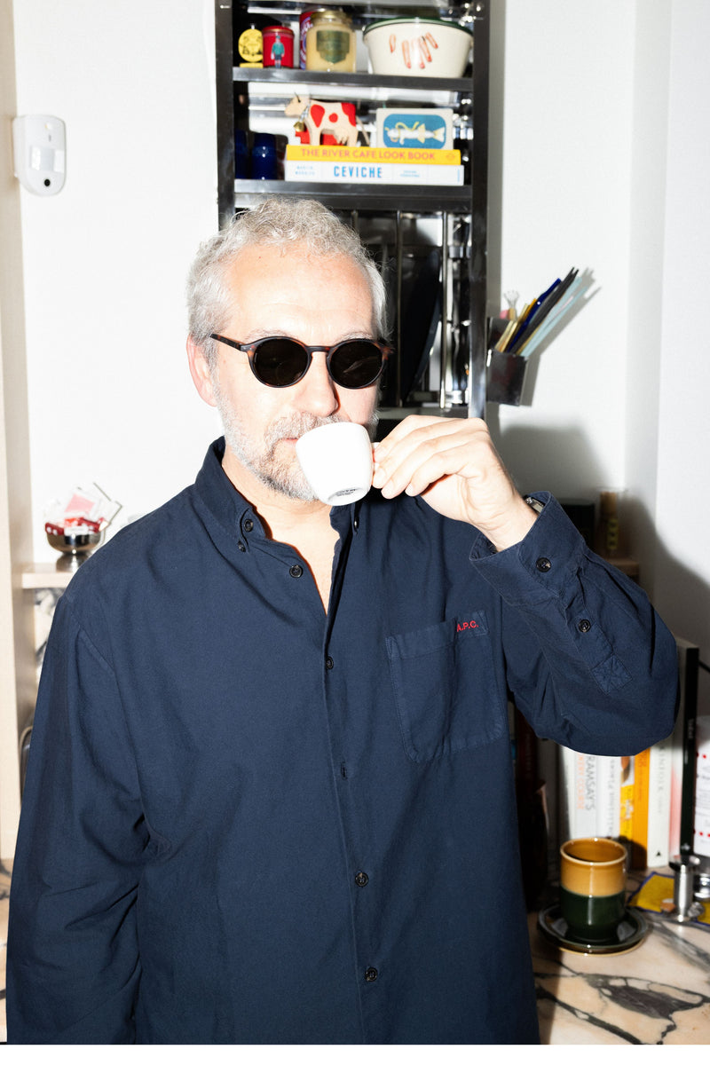
Good People of vitruta: Emre Özücoşkun
Interview: Alara Demirel
Emre Özücoşkun is a designer who not only shapes spaces but also collects stories. As the co-founder of Istanbul-based interior architecture studio Cisimdesign, his work weaves together aesthetics and timelessness through a quiet, deliberate language. The “Japandi” approach—a blend of Japanese simplicity and Scandinavian clarity—wasn’t something he adopted. It was simply where his instincts led him.
But Emre is more than his practice. His world stretches from the understated elegance of Mums and Paps in Karaköy to a growing collection of diving watches (despite not being much of a swimmer), every single issue of Monocle, and the lifelong devotion of a Liverpool fan. With an eye for detail and a sense of rhythm rooted in memory, he creates meaning across objects, cities, and friendships.
In this conversation, we follow Emre’s way of seeing—from the quiet resonance of his design philosophy to the emotional architecture of belonging. His first memory of vitruta? The Karaköy store, of course—still vivid, still shaping his thoughts on what a good space can be.
Great to have you here, Emre! Let’s kick things off with our usual opener: How would you describe yourself to someone who doesn’t know you? Who is Emre? Where did it all start, what have you done, and where are you now?
Tough question to kick things off with—so I’ll keep it brief. With a few exceptions, I’ve spent most of my life in Nişantaşı. That’s where I’ve put down roots. And from there, travel has become the center of my life—travel for art, design, fashion, food, music, football... basically all the things that make me who I am. I’m also the co-founder of Cisimdesign, an interior design studio based in Istanbul.
You’ve been working with Erdem İşler—your friend from college and now long-term business partner—for many years. What’s been the most rewarding, and the most challenging part of building a studio practice together?
Our story actually goes back even further than university, but we really got to know each other and grew close during those years. The most rewarding part of working together is that, over time, we’ve developed a shared language. At this point, we can practically read each other’s minds—which makes everything move faster and more efficiently.
As for challenges... none come to mind in the usual sense. But here’s an interesting side effect of working together for so long: we’ve started to become a lot like each other. Our design instincts and aesthetic sensibilities are so aligned now that we rarely disagree. That might sound ideal, but it also means we have to make an extra effort to push each other—to bring in fresh perspectives and keep evolving.
The way you approach design often reflects what’s now called the “Japandi” aesthetic—a blend of Japanese simplicity and Scandinavian clarity. Why does that feel like such an intuitive fit for you? And how do you think the balance you strike between material, color and form holds up in today’s fast-paced culture?
Back when we started Cisimdesign, “Japandi” wasn’t even a term people were using. But instinctively, we gravitated toward both Japanese and Scandinavian influences. So when we eventually came across the label, it felt like a natural match. We realized we’d already been working that way—this just gave it a name.
The balance we aim for between material, color and form isn’t just an aesthetic choice. It’s also a response to the speed and noise of today’s world. We’re not chasing trends—we’re drawn to timelessness, to simplicity. In a time when so many people feel overwhelmed, we believe in the value of creating spaces that feel calm and breathable.
You’ve worked on projects of different scales across Istanbul but it feels like Mums and Paps in Karaköy hold a special place. How do you approach the relationship between design, neighborhood rhythm, and the memory of a place?
In a way, these two projects are the clearest expression of what I mentioned earlier. For us, they represent what timeless design looks and feels like. They’re the kind of spaces where you can’t quite guess what decade they were built in—simple, quiet, and free of unnecessary ornamentation. They’re not chasing short-term popularity; they’re spaces that have quietly strengthened their identity over time. And that has a lot to do with the consistent, thoughtful approach of the people behind them.
Karaköy has gone through so many shifts over the years—booms, lulls, waves of hype—but Mums and Paps have managed to stay true to themselves through it all. When we were designing them, we didn’t just think about the interiors. We paid attention to the street, to the rhythm of the neighborhood, to what people expected or needed from the space. That sense of permeability—of inside and outside speaking to each other—is what helped them build an honest relationship with the area. And I think that’s where design becomes not just physical, but social too.
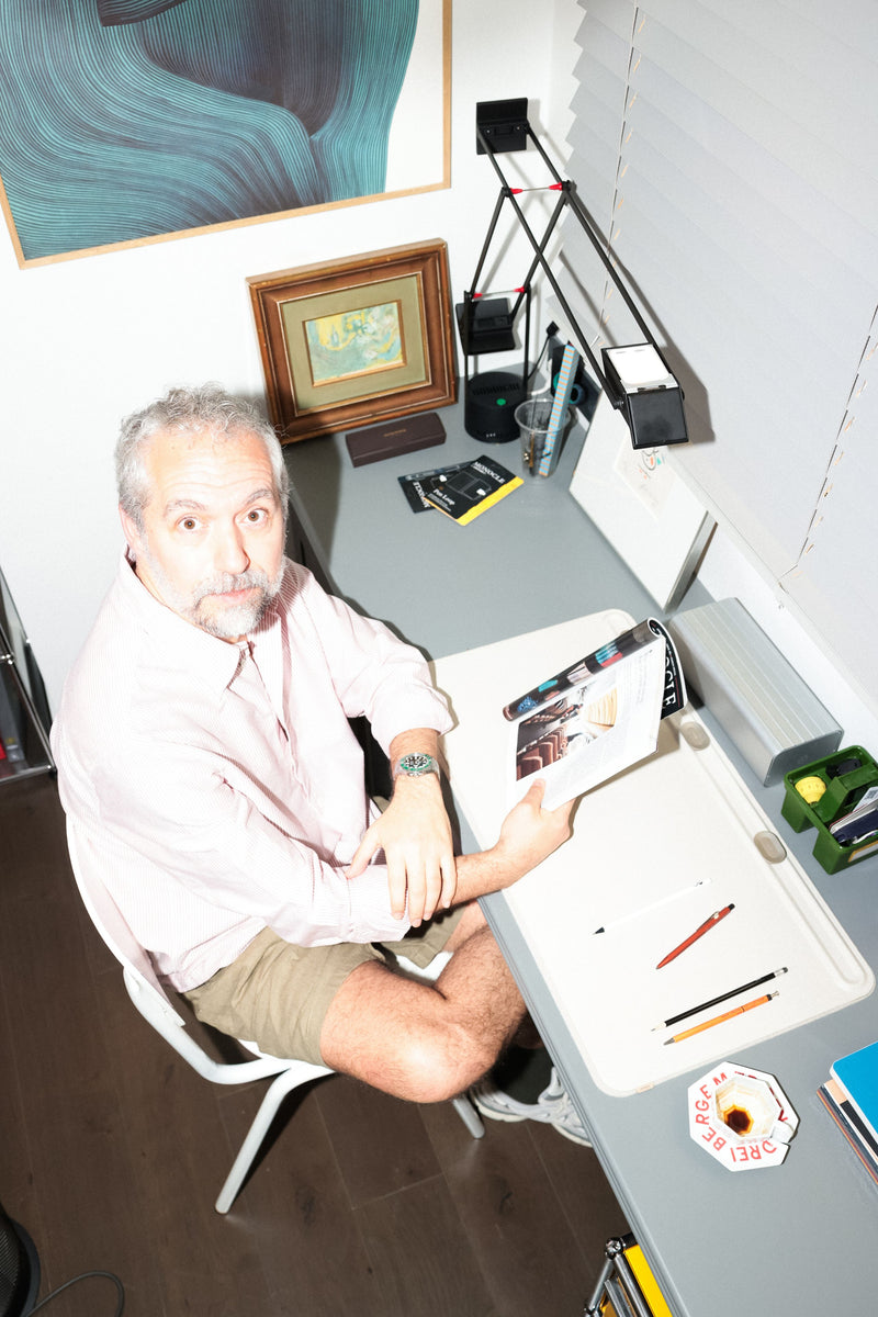
Your collecting habits seem to echo your work as a designer. We’ve heard you have a watch collection—with a particular interest in dive watches. Where did that connection start, and what do these objects represent for you?
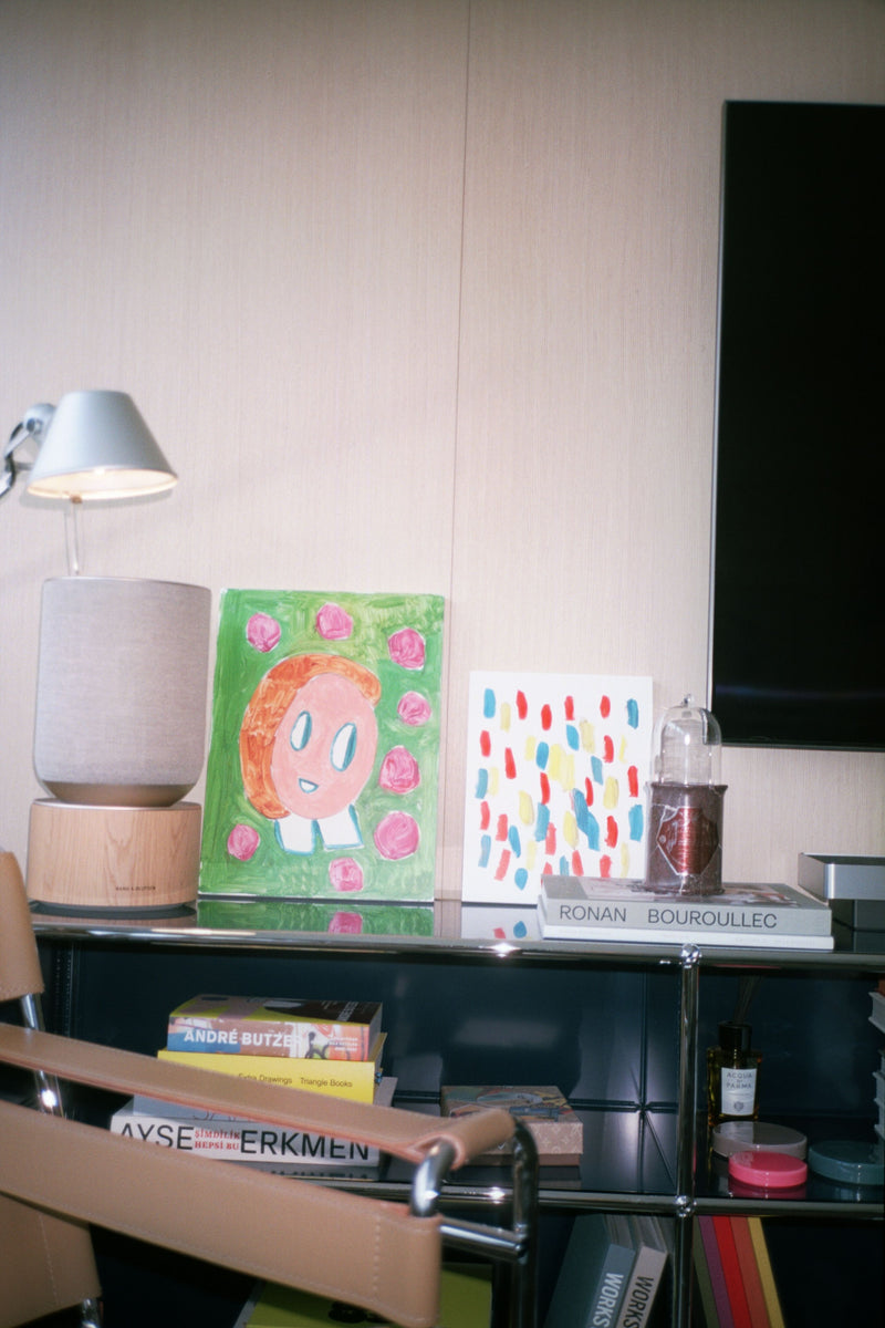
I guess I’ve always had a habit of collecting things—even as a kid. Over time, as my taste and lifestyle evolved, that habit grew with me. These days, I collect all sorts of things: art, watches, matchboxes, coasters... anything that speaks to me in terms of design or content. The variety is part of the fun.
Most of my collections are closely tied to my work. Anything with a strong visual identity grabs my attention. I hesitate to call them “collections,” to be honest—I still approach them with a bit of an amateur spirit. But the connection between watches and architecture is especially clear. With both, it’s all about design, detail, material, and craftsmanship.
My first watch came from a close friend—he gave it to me as a birthday gift, and that really sparked it all. And yes, I know it’s funny that I collect dive watches even though I’ve never gone diving in my life. I’m not much of a sea person either. But again, it’s the design, the build, the way it all comes together—that’s what gets me excited.
You also collect every issue of Monocle, and a growing number of artworks. How do you think your sense of aesthetics has evolved over time? When you're drawn to something, is it the story behind it—or just the object itself?
Out of everything I collect, Monocle is the one I’ve followed the most consistently. I was already waiting for the very first issue to drop back in 2007—before it was even published. I knew the people behind Wallpaper were starting something new, and I had a feeling it would speak to me. And it did. I haven’t missed a single issue since.
But my relationship with art is much more fluid—definitely more experimental. Looking back, I don’t really have any pieces that make me wonder “Why did I buy this?” So I guess I’ve been lucky. When it comes to design, story might be my first instinct. But with art, it’s more about what I feel the moment I see it.
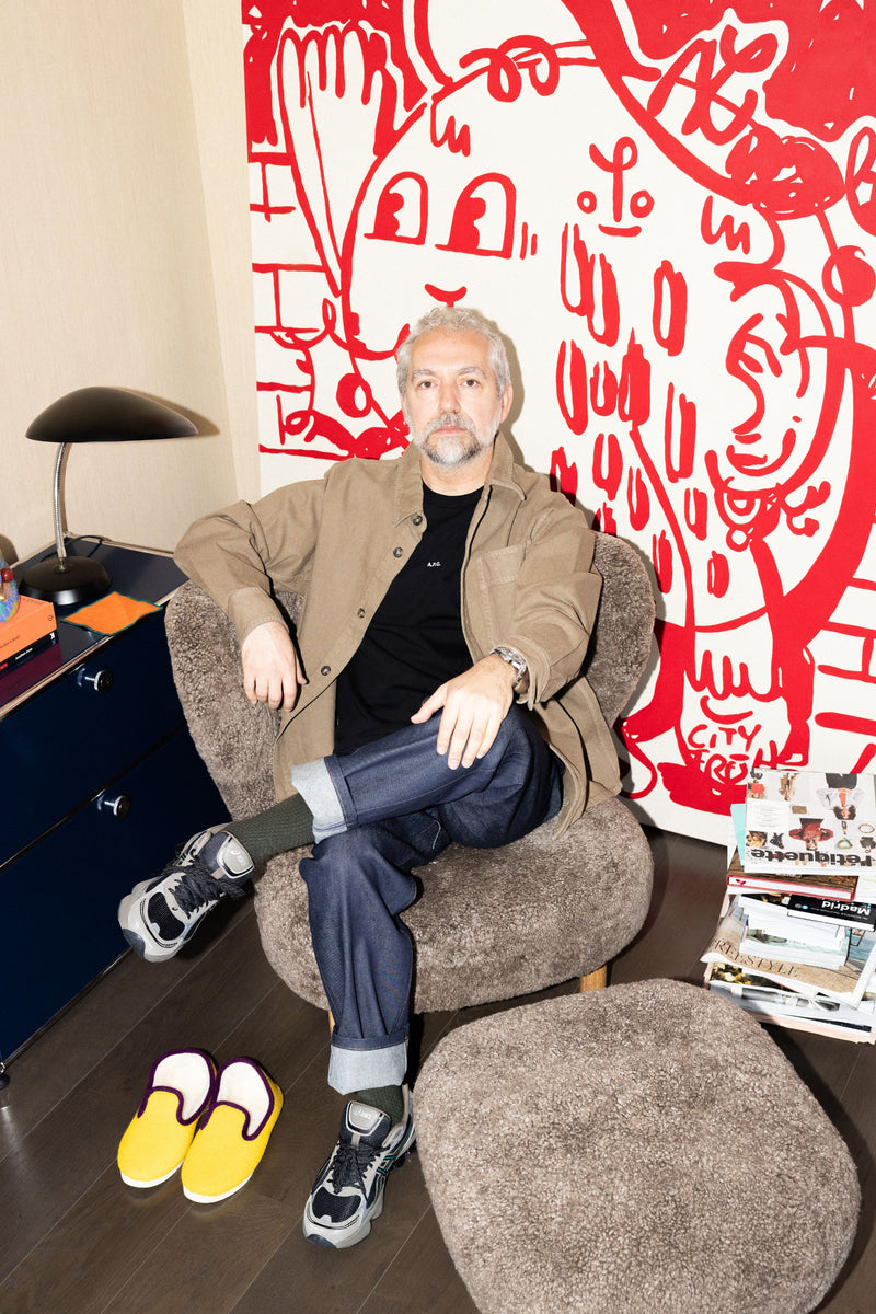
We saw you in a Liverpool jersey on Socrates. Where does football fit into your life? Is your love for Liverpool just about the team—or does it go deeper, maybe even into style, music, politics?
I was really young—must’ve been around six—when I was taken to a match at Wembley. At the time, I had no idea what I was watching. Turns out, it was one of those legendary games that would go down in history.
What stuck with me wasn’t just the football—it was the energy of the Liverpool fans. The way they lifted the team up, even when they were losing. And then the team came back and won. That moment left a mark. I remember thinking, “That’s it. I’m a Liverpool fan now.”
It might sound a bit intense, but being a Liverpool supporter has shaped how I see the world. It’s influenced how I dress, the music I love, even my political views. So no, it’s not just about football. It’s much bigger than that.
As an interior architect, which cities, buildings or spaces inspire you the most?
When I travel—whether for food, fashion, art or design—Tokyo and Copenhagen are always at the top of my list. Both cities have a kind of simplicity that runs deep. It’s never shallow. In Tokyo, places like Daikanyama T-Site, Case Gallery and the Nezu Museum are incredibly rich, both architecturally and in terms of content. In Copenhagen, the Louisiana Museum stands out. Honestly, anything touched by Norm Architects feels meaningful to me. There’s a sense of depth that comes from tradition, and an ability to stay minimal without being cold.
Besides those, I also find inspiration wandering around cities like Milan, Vienna and London. But lately, Tokyo and Copenhagen have definitely taken the lead.
When you visit a city for the first time, what do you look for? Where do you feel most at ease?
I usually start with the classics. The oldest bar, café, restaurant, museum, gallery... whatever the city is known for, I want to see that first. I think there’s value in getting a sense of the obvious before diving into the local side of things.
Once I’ve done that, I shift into a slower rhythm—more like a local. I walk through neighborhoods, check out where the good coffee is, explore shops that blend local and international brands, and figure out which districts house the art galleries. I pay attention to who lives where, how people move, what the pace feels like. It’s all about tuning into the rhythm of the city.
And for the last question… What comes to mind when you think of “vitruta” and “Good People”? It could be anything—a brand, a neighborhood, a person, a color, or an event.
When I think of vitruta, I think of the Karaköy store. Maybe because it was the first, or maybe because it just felt ahead of its time—but it left a lasting impression on me. I feel like it really laid the groundwork for what the brand would become, and helped shape its direction.
As for Good People, it gives me a strong sense of togetherness. People who are similar, but also very different—kind of like the brands you see at vitruta. Carefully curated, but still full of surprise. That combination feels familiar to me, and yet always refreshing.
You can click here to see the products Emre Özücoşkun used and chose in the shoot.